Media Hub Web Design & Content Management
Skills: UI Design, UX Research, Content Strategy & Management, Website Optimization
Tools: WordPress, Adobe XD, HTML & CSS
Managed in 2024 for UNC’s Media Hub
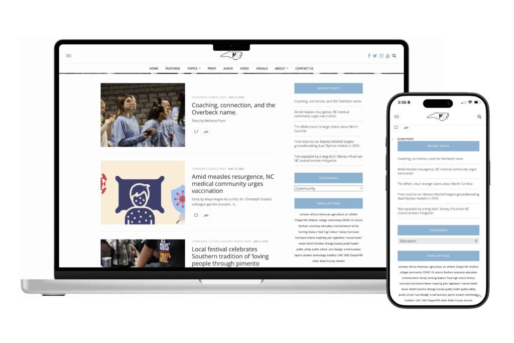
As the Webmaster, I managed the website by overseeing 100+ story posts from 35 students. I created thorough posting guidelines and redesigned the navbar, footer, sidebars, and various pages, thus improving upload times, site performance, design consistency, website functionality, and—most importantly—story discoverability.
This role lasted four months, during which I focused on improving site functionality to boost foot traffic and increase story pickup by external media outlets. I worked within existing design frameworks, prioritizing structural and performance enhancements over full visual redesigns.
Web Design
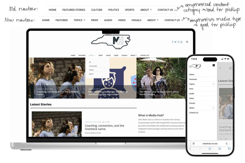
- Redesigned the site’s navigation to prioritize media formats—print, audio, video, graphic—making it easier for media outlets to find content by type, the primary use case of the site (because most news outlets directly partnered with us specialize in a particular media type, and therefore browse our site accordingly).
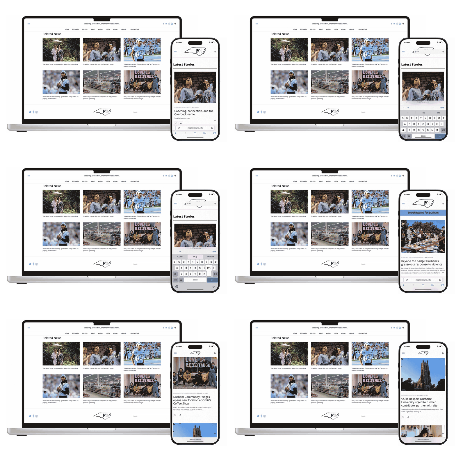
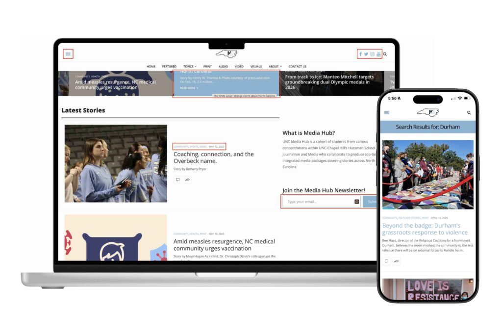
- Introduced a robust search feature accessible from the navbar and footer, enabling users and media professionals to quickly locate stories by title, author, category, tag, or keyword—greatly improving content discoverability.
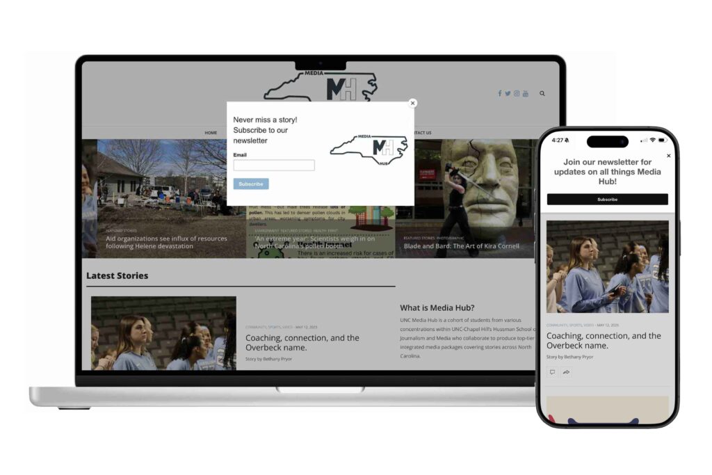
- Implemented a timed lightbox newsletter subscription prompt that appears site-wide within 5 seconds of a user’s first visit, as well as adding a call-to-action button to the home page’s sidebar to boost user engagement and drive overall site traffic.
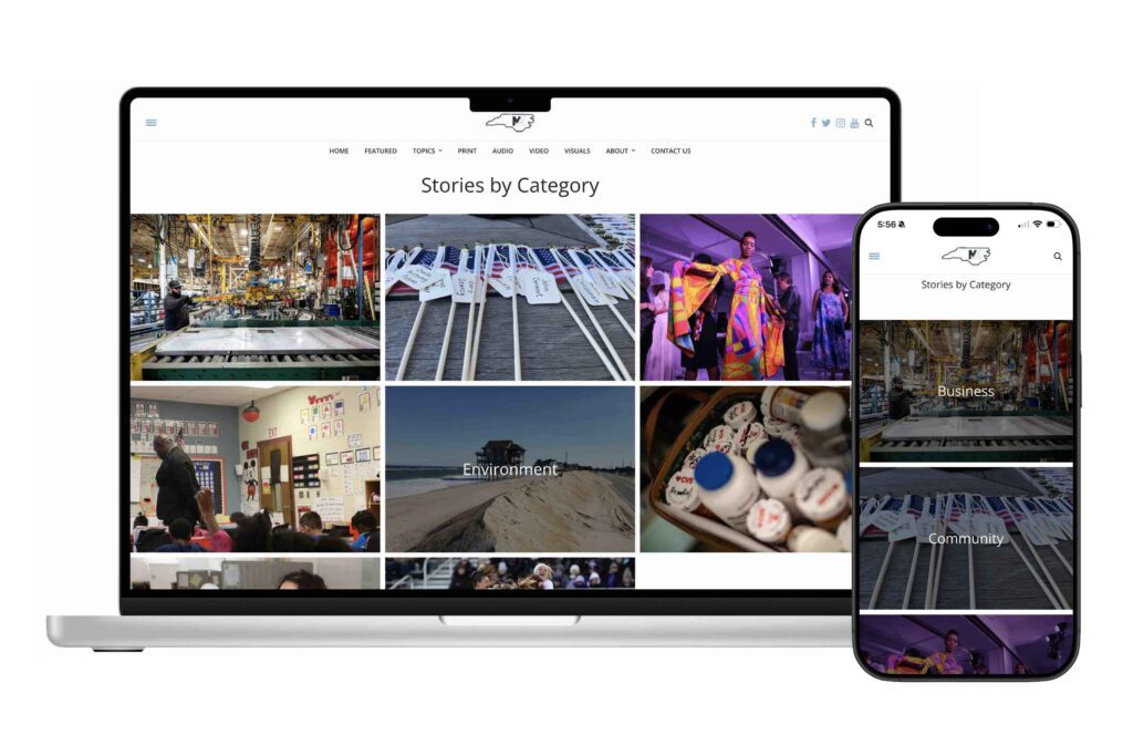
- Created a visually engaging “All Categories” gallery page using archive templates, and assigned custom header images to each category page to strengthen visual identity and ease of navigation.
- Updated archive page sidebars, adding modules for recent stories and trending tags to encourage deeper browsing and improve user experience.
- Used custom CSS to include brand’s styling site-wide, such as Carolina-blue headings, social icons, hover features, buttons, and more.
- Improved visual layout and usability of static pages by enlarging text and images on the team page, reducing excess white space, and enhancing readability and aesthetic appeal.
Content Management
- Developed and enforced comprehensive story submission guidelines—including formatting standards, optimized image requirements, tagging conventions, and consistent author attribution—to ensure design cohesion, improve site performance, enhance SEO, and enable automated content indexing through dynamic blog posts. By standardizing the upload process through a clear checklist, content could be uploaded up to 5x faster, enabling timely publication of more stories while ensuring professional presentation.
- Redesigned the site’s taxonomy by consolidating 1,500+ tags and 130 categories into a streamlined system of 215 tags and 12 well-defined categories, while clearly distinguishing between broad categories (media type and topic) and specific tags (demographics, subjects, locations). This structure made it significantly easier to discover related stories through automated content grouping, dynamic archive pages, and intuitive browsing hubs.
- Optimized the featured stories page by limiting duplication across media types, allowing more unique stories to be highlighted and increasing the diversity of content exposure.
- Streamlined backend performance by removing outdated or unused plugins, consolidating overlapping functionality, and ensuring all tools were updated—significantly improving page speed, backend responsiveness, and editorial workflow efficiency.
Conclusion & Next Steps
These changes I made contributed to increased visibility and pickup by external media outlets, thus advancing the core goal of the project: to provide student journalists with a platform for publishing real stories, showcasing their work professionally, and preparing them for success in real-world newsrooms.
Had this role been longer, my next step would have been to fully redesign the website, modernizing its layout and style to emphasize the professionalism of the work it showcases, as well as ensuring web accessibility standards. First and foremost, I would streamline the navbar—eliminating the existing 2-row layout that takes up unnecessary space—and create various sections on the home page to showcase work of various media types and topic categories.
