Isla de Fuerza

Skills: Art Direction, Branding, Graphic Design, UI Design
Tools: Adobe Illustrator, Adobe XD, Procreate

Created in spring 2023 for MEJO 584 (International Projects)

Every spring semester there is an international project class offered in the Hussman School of Media and Journalism in which “students work on a semester-long documentary multimedia project in an international location that includes photo and video journalists, audio recordists, designers, infographics artists, and programmers.”

For this particular spring, we reported on Puerto Rico. For the first half of the semester, we researched current events and planned our stories. During our spring break, we traveled to Puerto Rico to meet and interview our sources, as well as explore the territory. Between the time we returned and the launch of the website in late April, we worked countless hours to finalize our stories and their assets.

The class was divided into five story teams, and each team was to research—and ultimately create content for—one of the following topics: power, community, government, environment, and healthcare. Each team consisted of a reporter, photographer, videographers, and designer so that we could create a long-form article, photo story, mini documentary, and graphics, respectively. I was the designer for the government group, meaning I designed the interactive graphic for the article “Resistant, Not Resilient.” In addition to our individual graphics, the entire design team was responsible for the website’s branding and layout. The following sections break up these responsibilities.

Isla de Fuerza was a finalist for an Anthem Award in Diversity, Equity & Inclusion – News & Journalism. The Anthem Awards, from the International Academy of Digital Arts and Sciences, recognize social impact and had more than 2,000 entries this year.

Site Branding

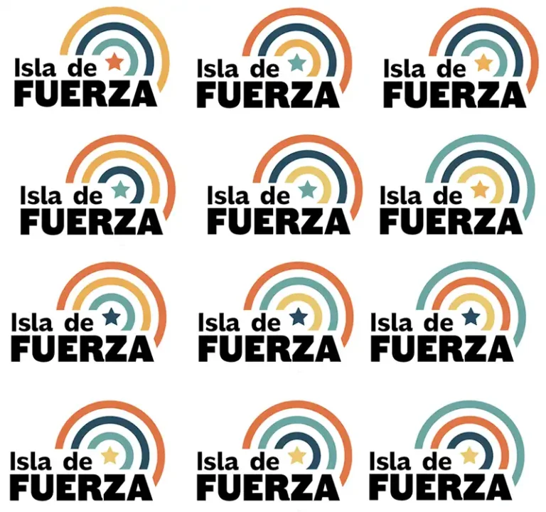
Our first task was to create a style guide, including a title, logo, color scheme, fonts, and tone words. As a class, we decided upon “Isla de Fuerza” (“Island of Strength” in English) to encapsulate Puerto Rico’s strong culture and sense of community, especially after the island was devastated by Hurricane Maria in 2018. I proposed five bright colors, inspired by Puerto Rico’s colorful architecture, flora and fauna, and gorgeous beaches: yellow, orange, orange-red, blue-green, and dark blue. I suggested that each color should represent one of the five stories. Here are my initial suggestions:

After some tweaking to make the colors feel more cohesive and bright, we chose the scheme below:

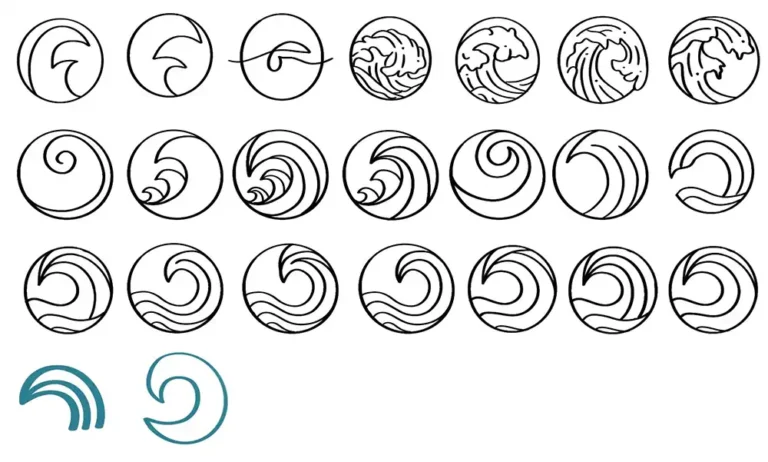
To tie in both “island” and “strength” I suggested that we experiment with logos using waves. I sketched a series of waves that could be used as our fav icon, and then tried to incorporate those waves into a logotype. I also played around with font weight, kerning, tracking, and leading.

However, my fellow designers and I agreed that these designs felt too frivolous and on the nose for “Isla de Fuerza.” Next, we tried simplifying the wave so that its meaning was more ambiguous and look was more powerful. We used the colors from our scheme to fill it in.

In the end, we felt that the streamlined wave looked too much like a political emblem or a rainbow, so we ultimately went with a simple but powerful logotype that incorporated our tagline.

Site Layout

For the site’s general layout, my team analyzed past MEJO 584 projects, especially Aftermath, which was also about Puerto Rico. We also gained inspiration from other multimedia documentary projects like the New York Time’s “Snow Fall”. Once we discussed how we could improve the functionality and responsiveness from past classes, I created mobile and web wireframes. Clicking the image below will take you to the Adobe XD file I made, which is not interactive since it is only an initial wireframe.

After we made basic wireframes, we researched interactive stories created by news publications for inspiration. We brainstormed how to incorporate various interactive features to highlight the reporting we were doing. I created the initial mockups of the site. Clicking the image below will take you to the second Adobe XD file I made, which is still not interactive since it is still meant to be a low-fidelity mockup.

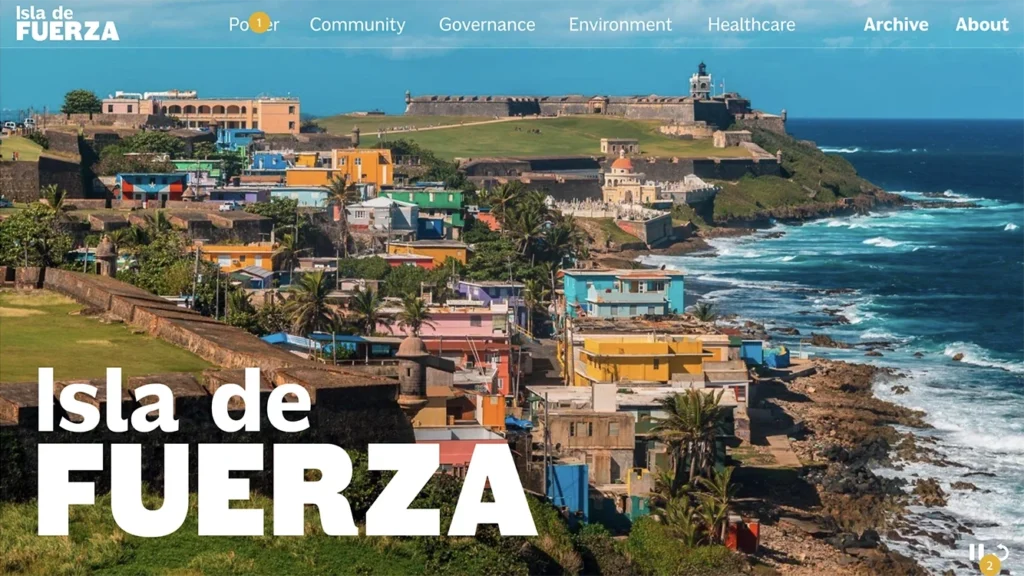
After further discussion amongst our team, as well as getting feedback from our design coach and other students in our class, we simplified the home page and story page design. Clicking the image below will take you to the final Adobe XD file we made, which is not interactive due to lack of time. The class developer used this as a guide for the website.

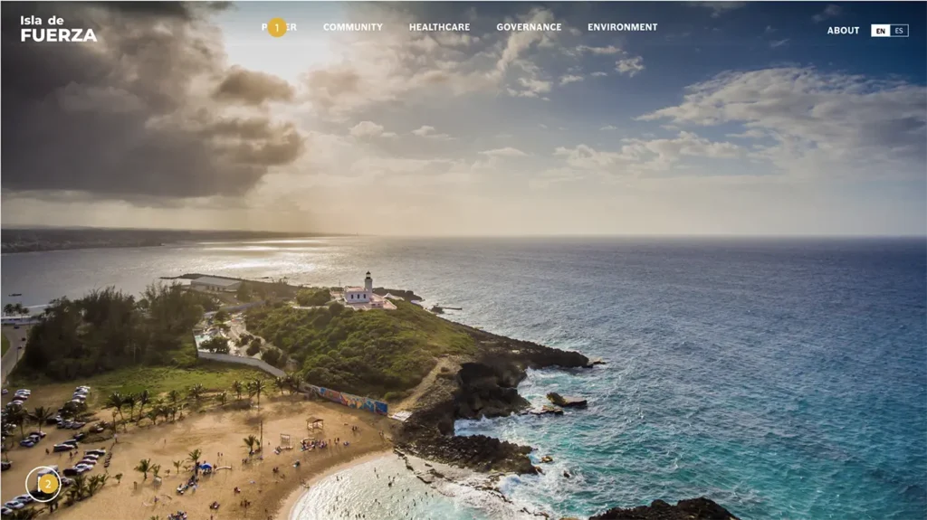
Check out the final website here.

Graphics

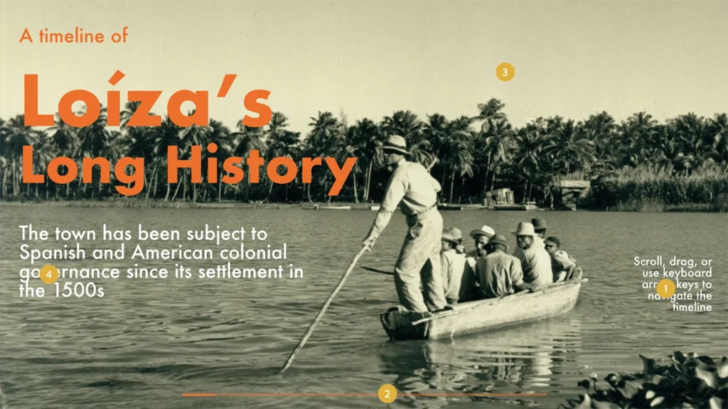
My team’s long-form article is about the town of Loíza, and how not only its local government, but also the government’s of Puerto Rico and the United States have failed its primarily Afro-Caribbean population. The United States’ acquisition and subsequent governance of the island of Puerto Rico are vital to the context of the town’s present political and cultural state. That said, the reporter of my team asked that I create a timeline of both the town’s and Puerto Rico’s relevant history so that she could focus on the problems currently plaguing its citizens.

My first task was to figure out what the interactive timeline would look like, and how media would be incorporated. I originally experimented with the size of both the computer screen and the accompanying media files (first three thumbnails in the image below). However, by focusing on the pictures to accompany the text, the text was lost. So I pivoted the design, and decided to make the timeline entirely text upon first glance (last thumbnail).

Once I decided upon this layout, I created an interactive wireframe so that the class’ developer could recreate my design in code. The following image is a link to the Adobe XD file.