Blue Sky Innovations Website Redesign
Skills: UI Design, UX Research, Art Direction, Content Strategy
Tools: Adobe XD
Created in 2023 for UNC’s Blue Sky Innovations
As a Design & Development Fellow, I conducted a full audit of Blue Sky Innovations’ website and identified key usability, design, and content issues. Major challenges included disorganized navigation, inconsistent design elements, outdated visuals, unclear project pages, poor mobile responsiveness, and a cluttered footer.
Noting misalignments between the site’s branding and the company’s work, I compiled a detailed report outlining areas for improvement. I pitched a redesign to the Creative Team Lead, Lab Manager, and CEO, who approved the proposal and tasked me with creating mockups. Using the company’s style guide and competitive research, I designed wireframes and a full-scale prototype, refining it through feedback from the Creative Team Lead.
Wireframe Iterations
I focused my redesign on the Home, Projects, and Project Detail pages—along with the navigation bar—since these were most critical to the user experience.
Home
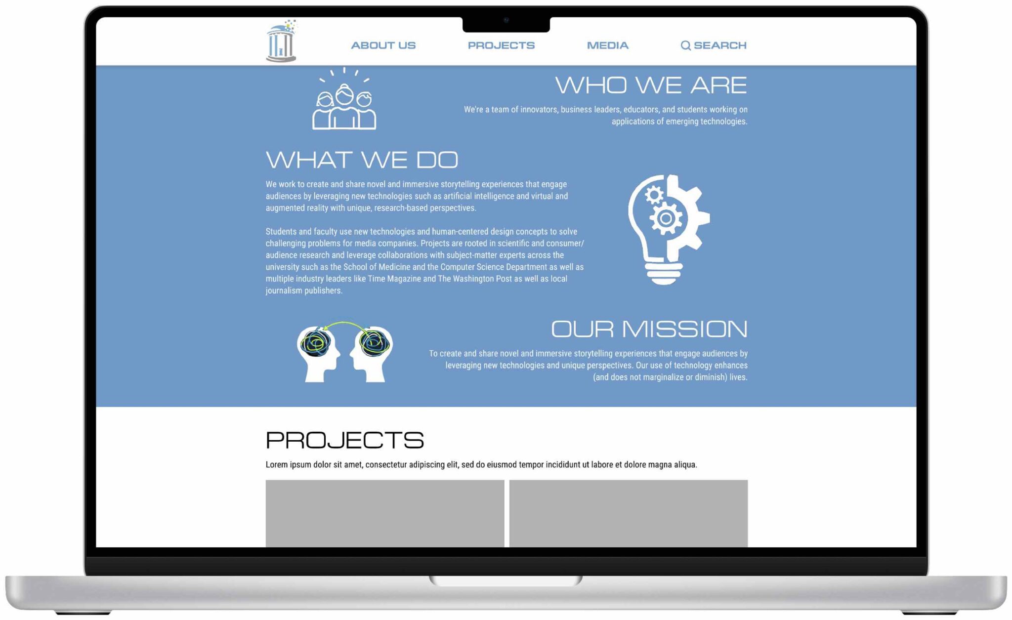
The original homepage lacked hierarchy and visual engagement. My redesign restructured it as an immersive introduction to the organization, featuring: a clear “Who We Are” section, featured projects and team highlights, social media and events integration, and streamlined calls-to-action. The goal was to guide visitors toward the company’s core work and community impact, creating an immediate sense of purpose and energy.
Other Key Pages / UI Components
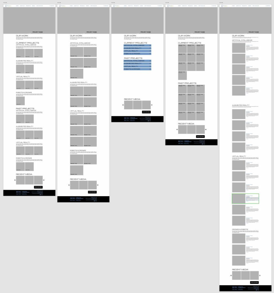
- All Projects: Previously, the site lacked a central place to browse all projects. I designed a dedicated “All Projects” page with intuitive filtering and a grid-based layout to improve discoverability. Different layout experiments included square and rectangular thumbnails, accordion views, and image-text pairings. The final design emphasized clean visual organization and ease of navigation.
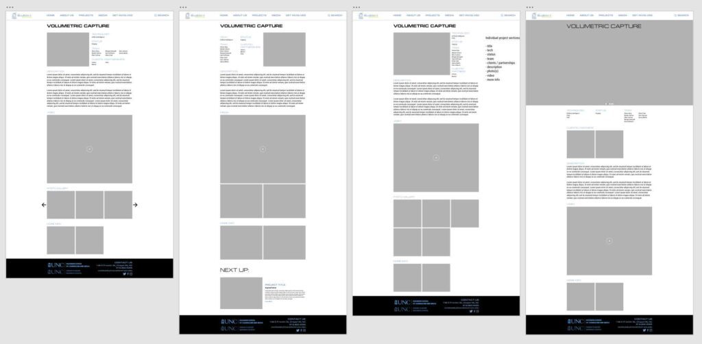
- Individual Project (Volumetric Capture): Individual project pages were rewritten and restructured to prioritize clarity and visual storytelling. Each page opened with a large splash image or carousel, followed by concise descriptions and embedded media—allowing users to explore projects without returning to the main index.
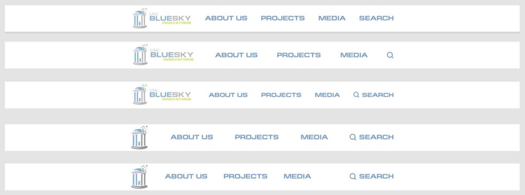
- Navbar: The old navbar was inconsistent and confusing, featuring duplicate “Home” links, missing search, and broken dropdowns. I developed several iterations with improved hierarchy, tested them with the Creative Team Lead, and finalized a clean, responsive design:
- Logo linked to Home
- “About Us” dropdown: DEI, Team, Events, Contact
- “Projects” dropdown: 4 main project categories
- “Media” dropdown: Blog, Videos, Photos
- Search button for usability
Clicking the first two images will take you to the respective Adobe XD files.
Final Mockup
The final prototype reimagined the site as a visual storytelling platform rather than a static portfolio. The homepage now spotlighted the organization’s work through full-width image carousels, embedded media, and featured stories. Calls to action were placed contextually—following relevant content rather than appearing as generic links.
Project categories were organized with “Current” projects first, followed by “Past” projects for better scanning. Individual project pages used a consistent yet flexible layout to accommodate different content types. I also introduced a new Events Page with a calendar and detailed event listings to strengthen user engagement.
Though I completed the redesign before implementation, the approved prototype represented a significant improvement in structure, navigation, and brand coherence. The project demonstrated a user-centered redesign process—balancing research, iteration, and visual communication.
Click on the following image to be taken to the Adobe XD file.
Site Structure & Page Types
- Home
- About Us
- DEI
- Team
- Staff Member Bio
- Events
- Projects
- Artificial Intelligence
- Volumetric Capture
- Artificial Intelligence
- Media
- Photos
- Photo Event
- Blog and Videos would link directly to the company’s Medium and YouTube accounts, respectively
- I did not build out Contact because the Creative Team Lead was unsure the page was necessary
- Photos
Reflection
While the redesign was not launched due to the company’s rebrand to Blue Sky Robotics, the project remains an example of applying UX principles and iterative design to improve usability and storytelling.
If revisiting it now, I would approach the layout with a mobile-first mindset, but this version still stands as a strong step toward a cohesive, accessible, and modern user experience.