American Fidelity Website Optimization Analysis & Design
Skills: UI Design, UX Research, Website Optimization
Tools: WordPress, Figma, HTML/CSS
Created in 2025 for American Fidelity (via Go Fish Digital internship)
This project involved a comprehensive analysis of the AmFi’s website to identify opportunities for improvement in accessibility, user experience, and design consistency. I evaluated site performance across visual design, navigation, and ADA compliance, and developed a set of actionable recommendations for the design, development, and production teams.
Since completing the analysis, our team has successfully implemented all proposed updates. I personally redesigned the customer review block and policy conversion banner to improve usability, custom-coded dozens of buttons and links on the site to match the official brand palette, and perform monthly audits to improve ADA compliance. These enhancements have helped create a more cohesive, accessible, and user-friendly digital experience.
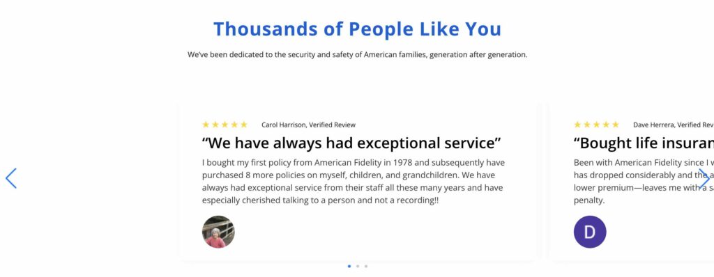
Original Customers Review Block (Web):
Updated Block I Designed (Web):
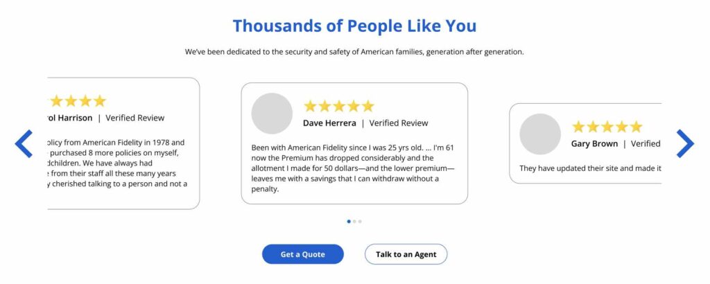
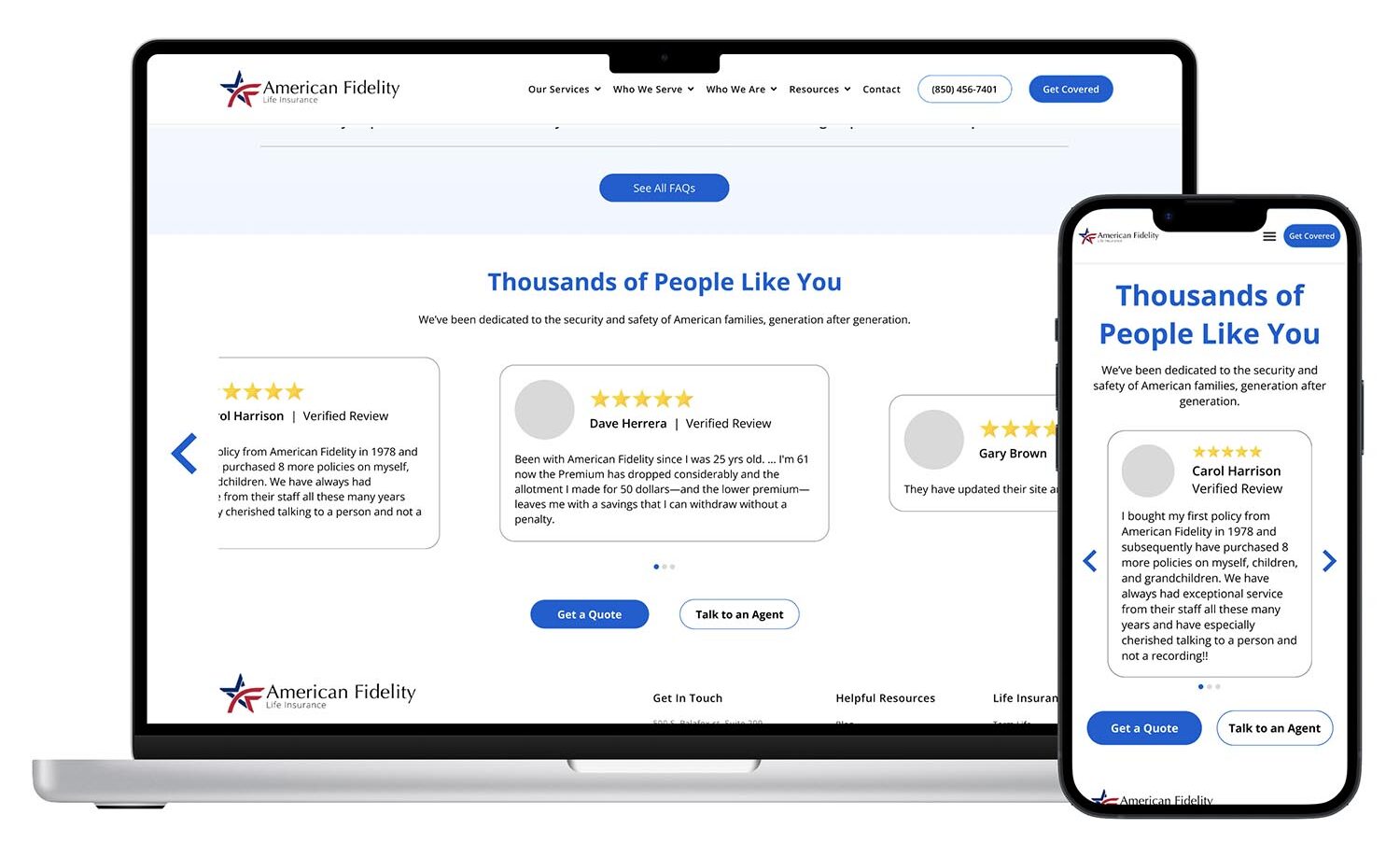
Updated Blocks I Designed (Web + Mobile): Altering the internal layout, border, and height improves visual hierarchy, contrast with the background, and overall functionality.
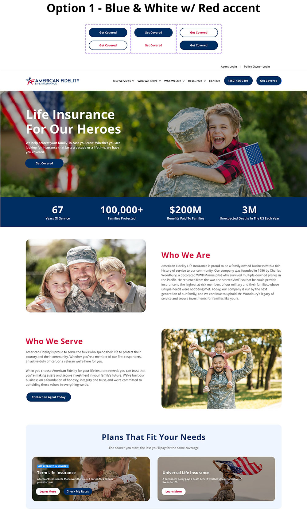
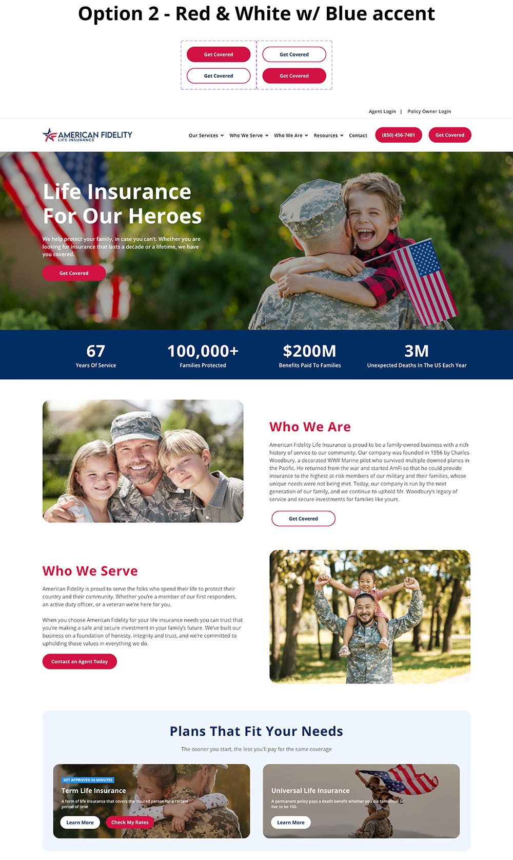
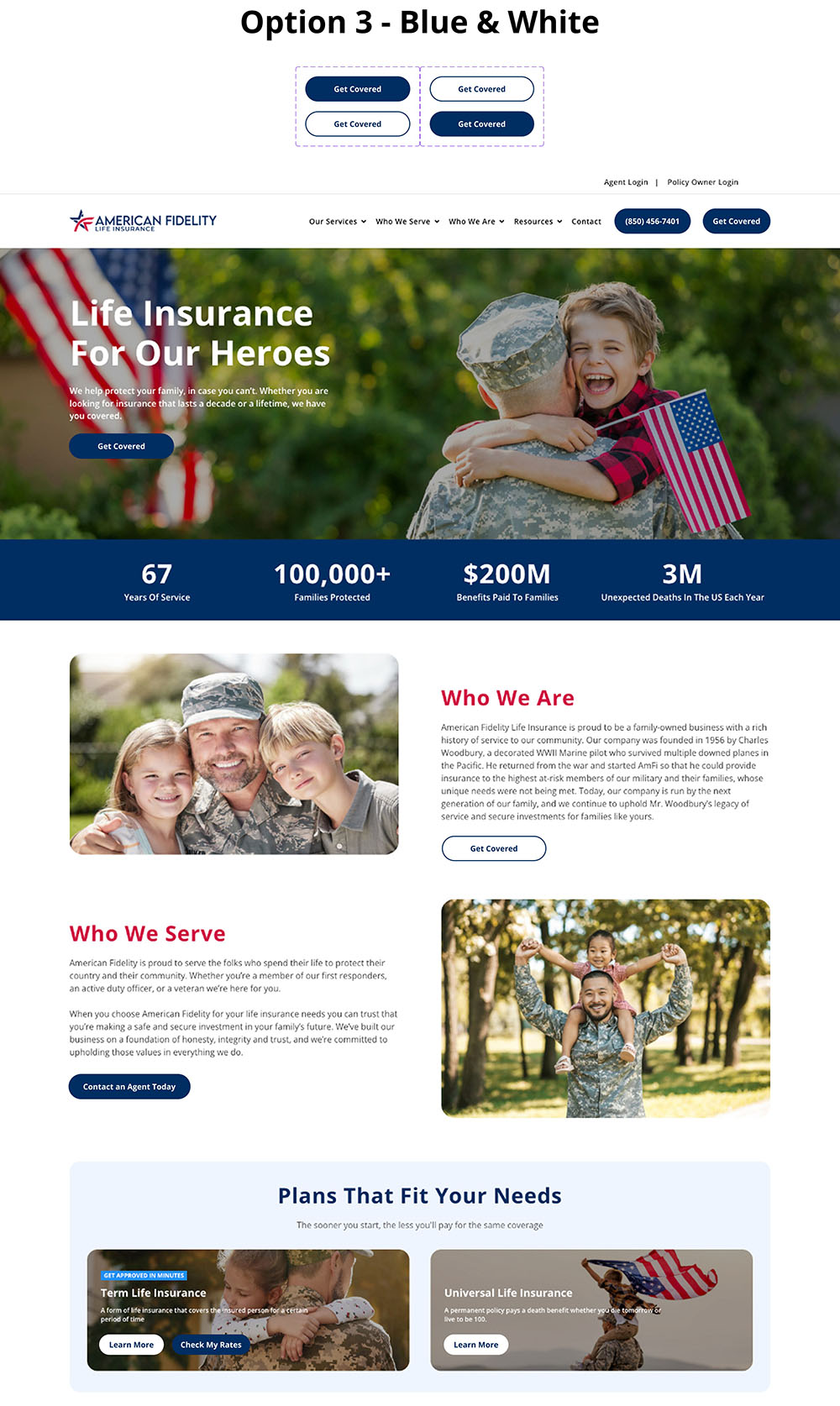
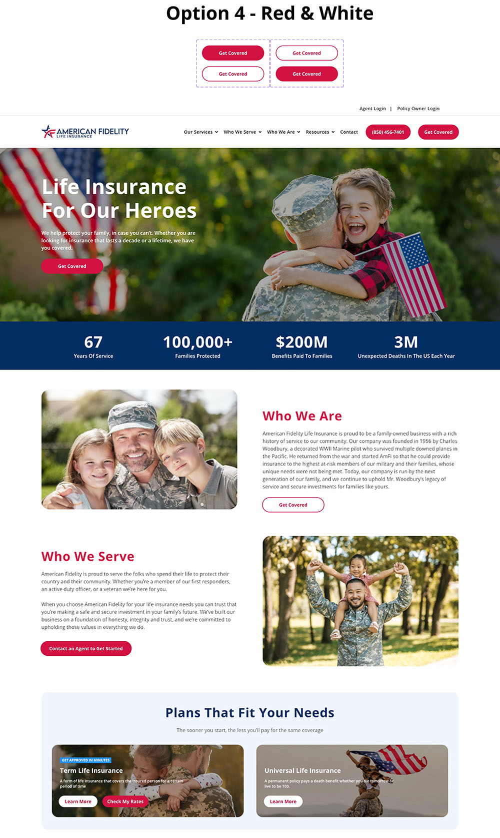
Shortly after all of the recommendations from the analysis were made, AmFi made adjustments to their brand colors. It was my job to update the website to incorporate these new colors, which meant editing the headers, in-text links, buttons, and block backgrounds.

To comply with ADA compliance, text links must clearly differentiate from surrounding text using more than just color, ensuring at least a 3:1 contrast ratio with the body text. Originally, text links were #075CD3 blue. However, the new #002D62 blue fails the contrast requirement to the black body text, so I recommended that both text links and headers use the new #D21242 red instead. To balance the colors on the page, I recommended background blocks be changed to the new blue. For the button schemes, I designed 4 options that used their brand colors in different ways. Ultimately, I recommended option 1, as it keeps blue as their primary color while still incorporating red accents.
I am now preparing to begin a new optimization project that builds on this foundation, further refining site performance and accessibility across additional pages and interactive components.