The Sound of the Seasons: Visualizing Music Through AI

Skills: Art Direction, Data Processing & Analysis, Graphic & Information Design

Tools: Adobe Illustrator, Figma, Generative AI, Google Sheets, Microsoft Excel, Procreate, Spotify

Created in fall 2024 for ADN 592 (Special Topics in AI)

Project Overview & Process

For the final project in my AI class, we were allowed to choose any AI tools for a topic of our choosing. I chose to experiment with music analysis AI tools because listening to music—and by extension, curating niche playlists—is one of my biggest hobbies. My goal was to first use Spotify’s AI to create playlists representing each of the four seasons, and then use AI to analyze and categorize the songs within those playlists based on attributes like genre, instruments, BPM, and mood. I would then use these results to visualize how niche playlists differ from each other. In other words, I wanted to determine what makes a playlist “niche” and what encapsulates a song’s “vibe.”

AI Tools Used

  • Perplexity.ai – Learn the basics of music theory to identify musical attributes, how they interact with one another, and how they might represent the “vibe” of a song. Understand how Spotify’s AI works
  • Spotify’s AI playlist maker – Generate four playlists to represent each of the seasons based on text prompts
  • Song analysis tools – Experiment with a variety of up-and-coming platforms to get as much (accurate) data out of the songs as possible
  • ChatGPT – Brainstorm ideas for visual concepts and clean up data from analysis tools
  • DALL-E – Create covers for each of the four playlists to be used in my visualizations

Playlist Creation

I learned from Perplexity that creating an effective prompt for Spotify’s AI playlist maker involves being specific about what you want. It gave me the following guidelines to craft a successful prompt: specify genre or style, include mood or theme, mention activities or settings, add time periods or era, incorporate specific artists, and use descriptive language.

Since one of the goals of my project was to see how AI interprets prompts to curate music—so that I may understand what makes a playlist “niche” and what encapsulates a song’s “vibe”—it seemed counterintuitive to include time periods, artists, or genres in my prompt. That said, I only described moods, themes, activities, and settings, so that the AI could determine what types of music best encapsulated that “vibe.”

(You might have to refresh the page for the Spotify playlists linked below to appear.)

Winter

“Sitting by the fire with a cup of hot chocolate on a snowy winter day.”

Spring

“Laying in a meadow surrounded by flowers on a sunny spring day.”

Summer

“Driving along the coast with the windows down on a sunny summer’s day.”

Autumn

“Walking through a park and crunching on fallen leaves at golden hour in autumn.”

Each playlist had anywhere from 25 to 40 songs, and because some songs didn’t encapsulate the vibe that I described, I culled each playlist to 20 songs each. Then I added 5 songs from my own seasonal playlists.

Challenges with AI

  • Some programs required music files instead of YouTube links, which posed a problem since I stream music rather than own it.
  • Metrics were often unclear, inconsistent, and redundant. Cyanite offered 37 metrics (for comparison, Sonoteller had 11) and didn’t clarify their distinctions. Both of these platforms also had unexplained numerical values next to the musical attributes, making the data seem arbitrary even though it likely wasn’t.

These challenges made analyzing the songs a difficult process, and then making sense and use of that data even more difficult. Since these tools are built to analyze one song, not compare many, I had to manually hand-copy, standardize, clean up, and reorganize the data before I could analyze it, let alone visualize it. That said, I only had the time to analyze 10 songs from each playlist, rather than all 25.

Data Process

  1. Get raw data from Cyanite and Sonoteller
  2. Hand-copy the data to a Google Sheet – each song represented 1 row, with different musical attributes in each column
  3. Standardize the data between Cyanite and Sonoteller – 6 attributes were on both platforms, including: BPM, key, genres, subgenres, instruments, and mood
  4. Clean up and reorganize the data
    • Combine Sonoteller’s “lyrical” and “musical” moods → remove duplicates
    • Make new spreadsheets for genre, subgenre, and mood individually
    • Manually combine, delete, and switch genres, subgenres, and moods
      • Use “=count” function to count nonzero values for each genre, subgenre, and mood so I could combine / delete instances with only 0-2 total counts
      • Genres – 34 → 10 
      • Subgenres – 78 → 25
      • Moods – 118 → 40 (in hindsight, I regret narrowing this down so much)
      • 1 spreadsheet w all info → 5 individual spreadsheets
  5. Analyze the data via functions
    • Ask ChatGPT to give each mood an emotional rating from 0 to 1, with 0 being the most negative and 1 being the most positive
    • Count the occurrence of moods per season
      • → consolidate moods into “categories” → mood category count per season
      • → multiply each cell by emotional rating → avg mood count ratings → average season emotional rating
    • Replace each of the AI’s “arbitrary” numbers for each mood with the new emotional rating → sum ratings per song → song emotional rating
    • Min and max song emotional ratings to find emotional range of playlist
    • Count occurrence of genres, subgenera, and instruments per season
  6. Visualize the data

Design Journey

Sketches

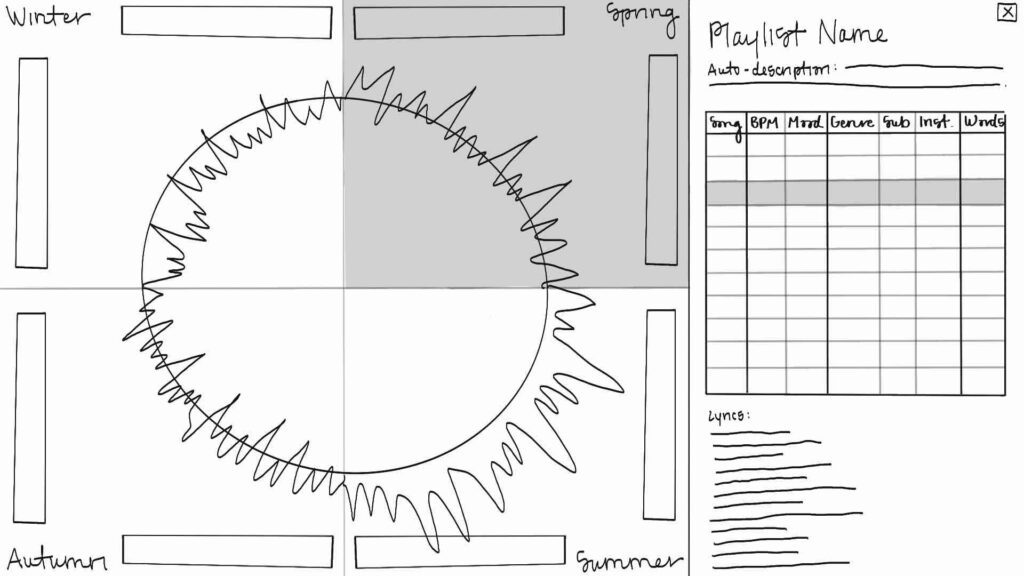
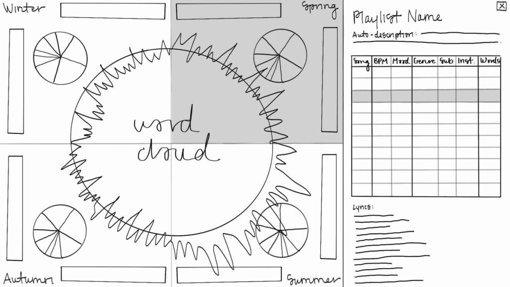
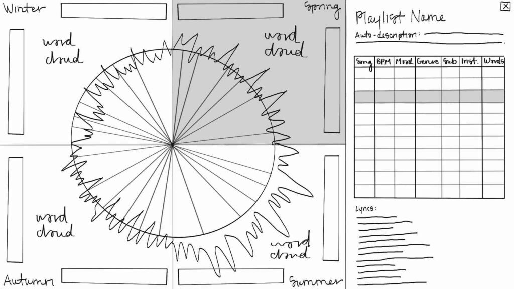
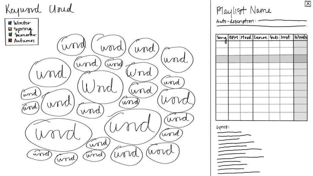
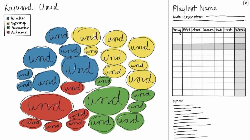
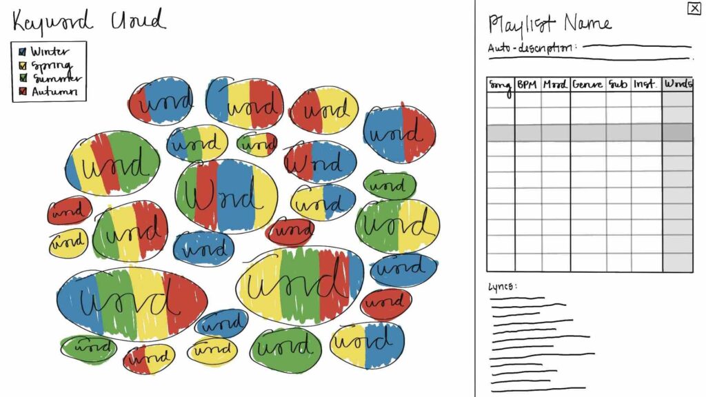
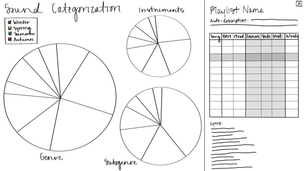
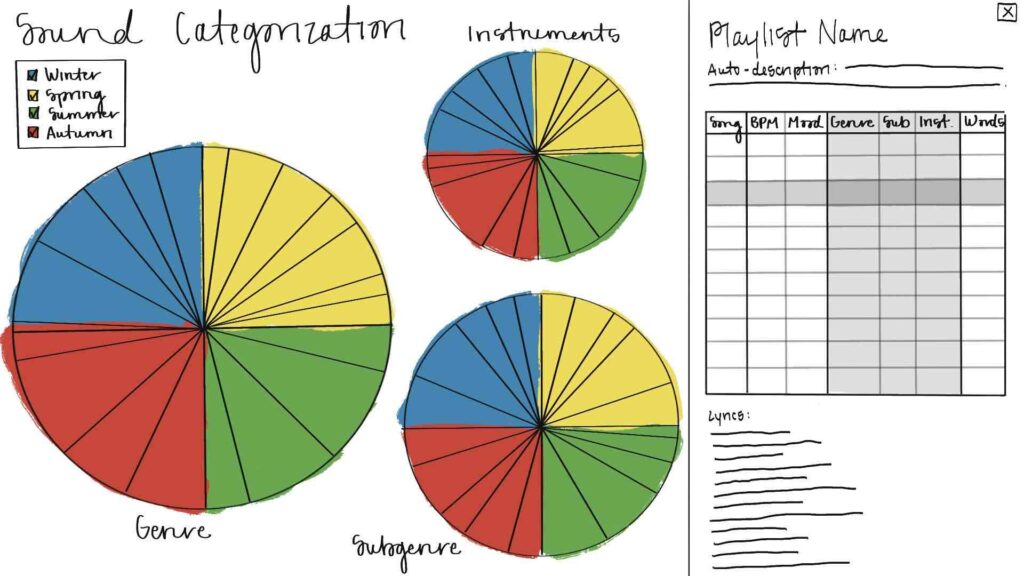
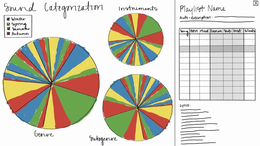
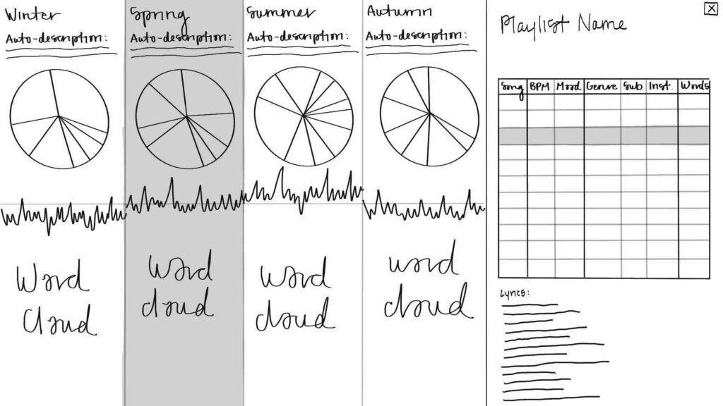
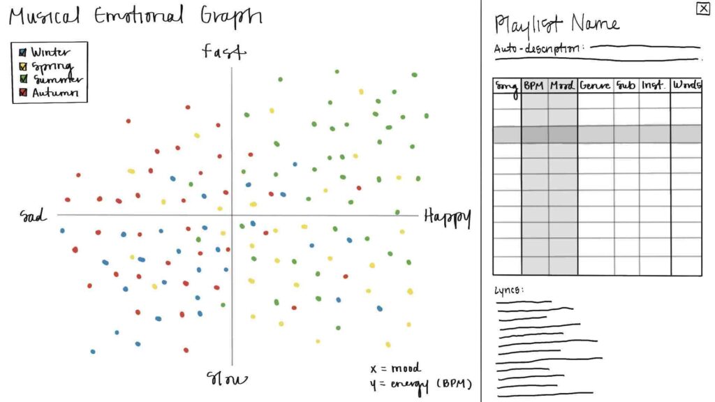
Originally, I wanted these visualizations to be interactive, coded, and mimic a platform in which other playlists could be analyzed, compared, and visualized. This is why my original sketches resemble multi-view dashboards. On the left side of the screen would be a color-coordinated, eye-catching visualization. There would be options for how many playlists and musical attributes to compare and display at once. Interacting with this side of the screen would affect the right side, which would have more “hard” data, such as an AI-generated description of the playlist, a table of songs and their musical attributes that could be filtered and sorted, and song lyrics.

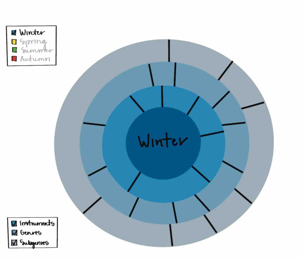
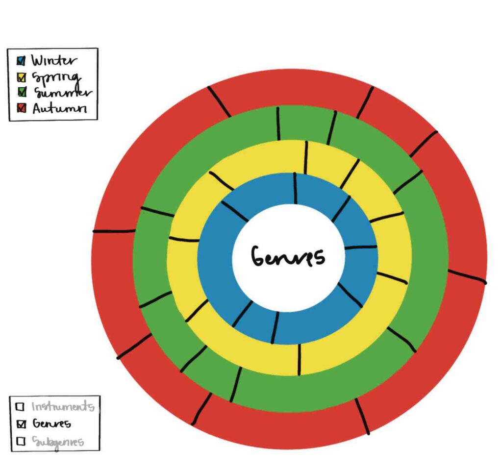
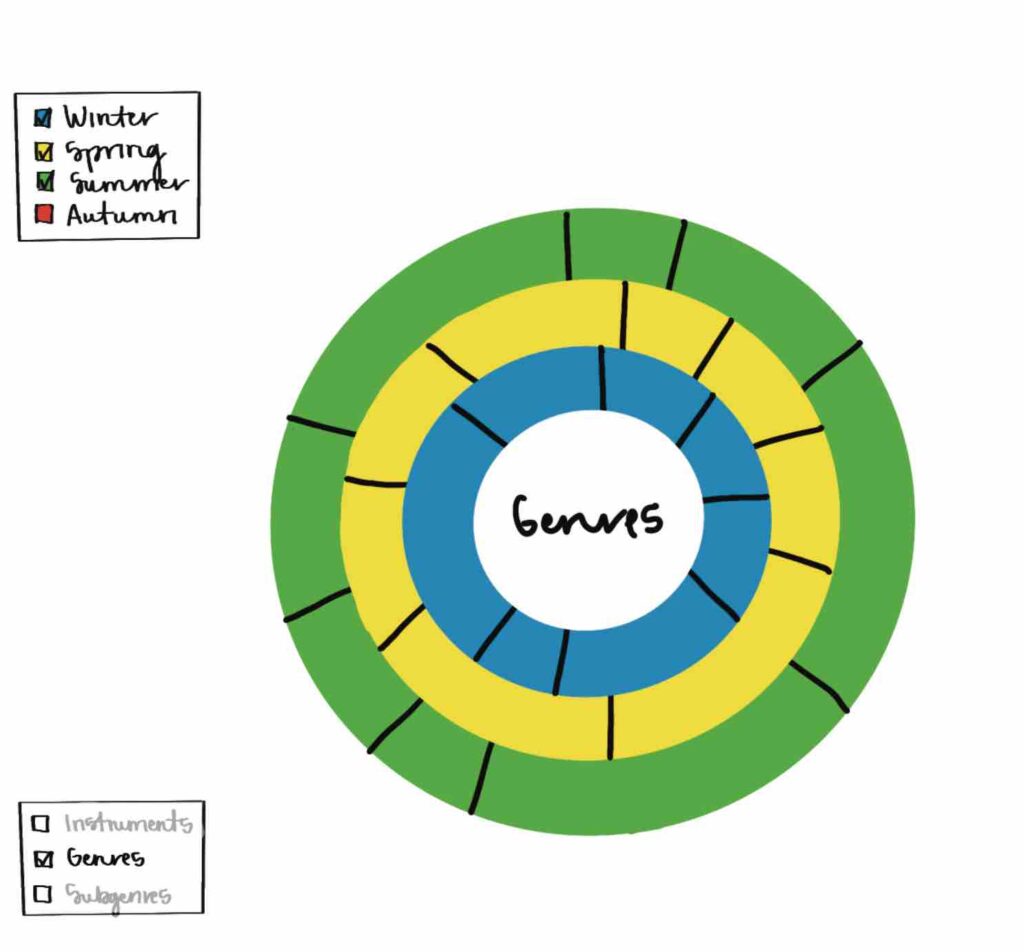
Once again, due to the time constraints of the class and the limitations of the AI tools, I ultimately designed a series of static images on Figma.

Iterations

Final Product

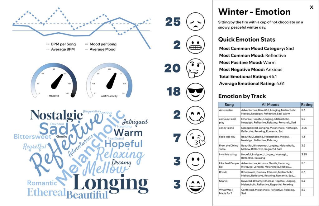
The following images are from the Figma file I used for my final presentation.

Insights

Predictions

Regarding BPM and mood, I expected that the seasons will be least to most upbeat/happy in the following order (correlating to temperature): Winter → Fall → Spring → Summer. Regarding sound, I expected that the seasons will be distinctive, with some instruments, genres, and subgenres being favored by some seasons over others.

Analysis

(I’ve used red, italicized font to indicate results that did not align with my predictions.)

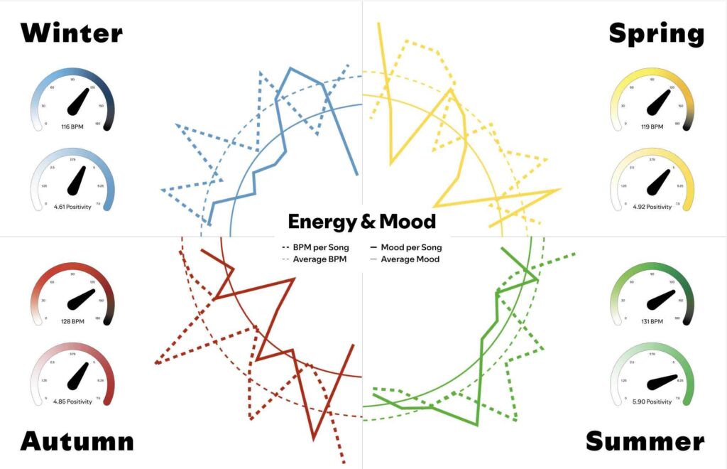
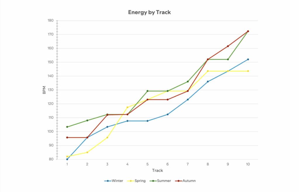
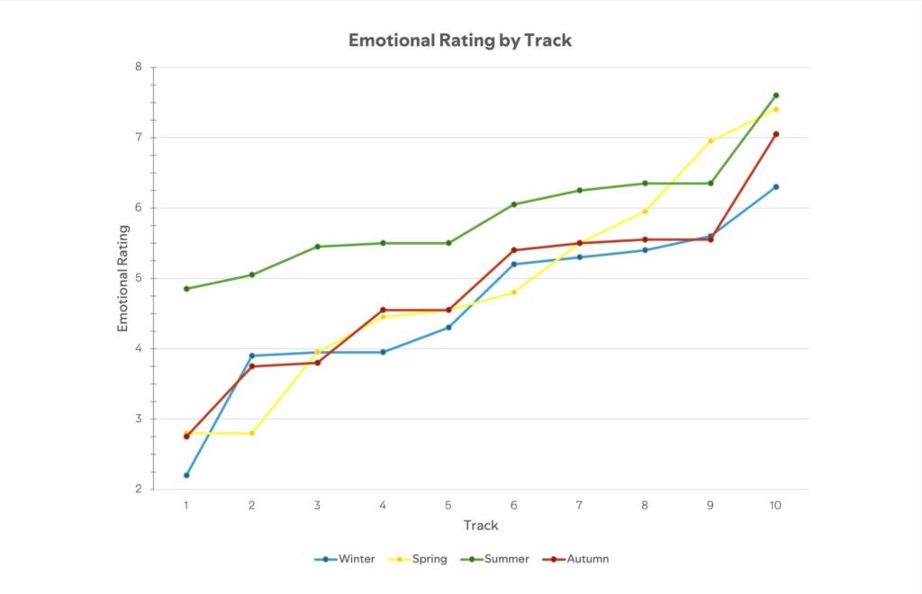
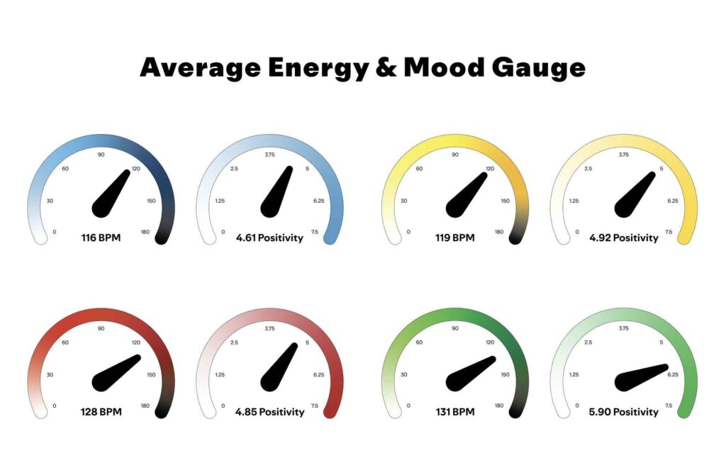
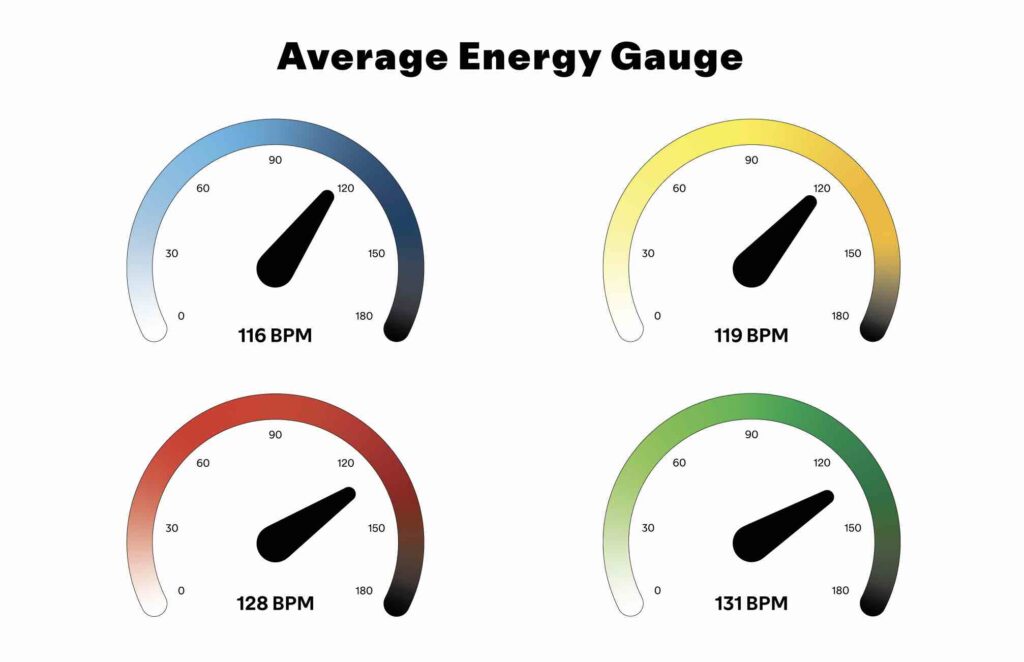
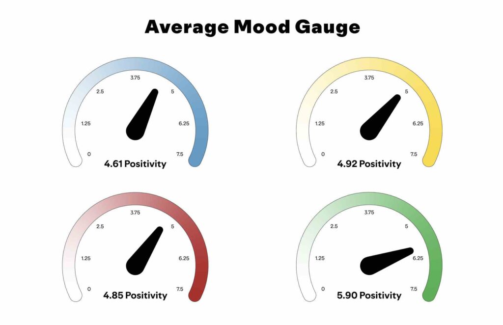
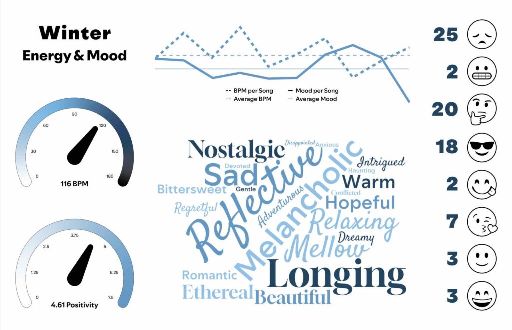
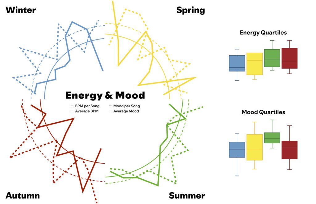
The average BPM per season, in order of lowest to highest, was Winter → Spring → Fall → Summer. Summer had the highest seasonal min BPM and highest seasonal max BPM, meaning it was the most consistently upbeat. The average mood per season, in order of lowest to highest, was Winter → Fall → Spring → Summer. Summer had the highest seasonal min mood and highest seasonal max mood, meaning it was the most consistently happy. Winter had the lowest seasonal min mood and lowest seasonal max mood, meaning it was the most consistently unhappy.

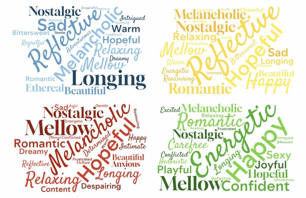
For the sad mood category, in order of highest to lowest counts of sadness, it was Winter → Fall → Spring → Summer, meaning Winter was the most consistently sad and Summer was the least consistently sad. For the introspective category, in order of highest to lowest counts of introspection, it was Winter → Fall / Spring (tied) → Summer. Introspection often arises during negative experiences because we want to understand and resolve discomfort, whereas when we’re happy, we rarely pause to question it. That said, these introspection results support my predictions for happiness.

For the very happy mood category, in order of lowest to highest counts of very happy, it was Winter → Fall → Spring → Summer. However, for the total happiness (combination of somewhat happy and very happy mood categories), in order of lowest to highest counts of happiness, it was Winter → Fall / Summer (tied)Spring.

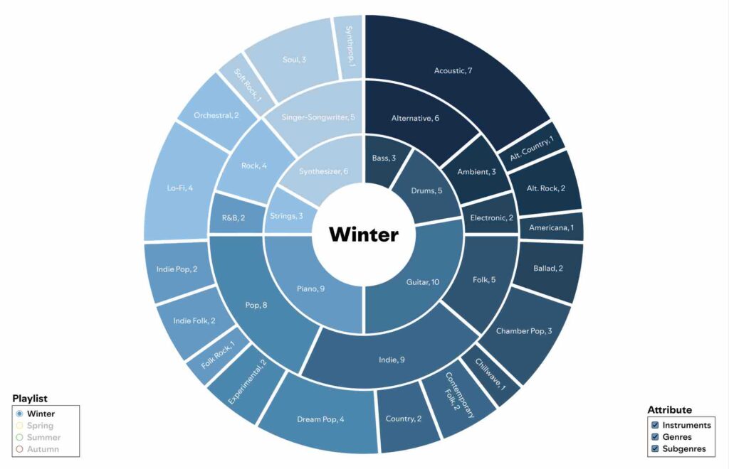
In regard to the sound categories—instruments, genres, and subgenres—summer was distinct from the three other seasons, but winter, spring, and autumn were not necessarily distinct from each other. Of the instruments, drum, bass, and synthesizer were favored in summer, while piano and strings were favored by the other seasons. Guitar was consistent across all seasons. Of the genres, electronic, hip-hop, and R&B were highly favored in the summer, while ambient, folk, and singer-songwriter were favored by the other seasons (summer had zero or only one instance for each of these). Indie, pop, and rock were fairly consistent across all seasons. Of the subgenres, dance, rap, and synth-pop were almost exclusively found in summer, while acoustic was the highest subgenre for all 3 other seasons. It was harder to compare any other subgenres besides these 4 due to the high number of subgenres and low number of songs per seasons.

For the most part, my predictions came true. However, it must be kept in mind that there are only 25 songs per playlist, and due to the limitations of the AI, I only analyzed 10 songs from each. Due to the small sample size, the results were easily swayed by outliers and there was a larger margin of error.