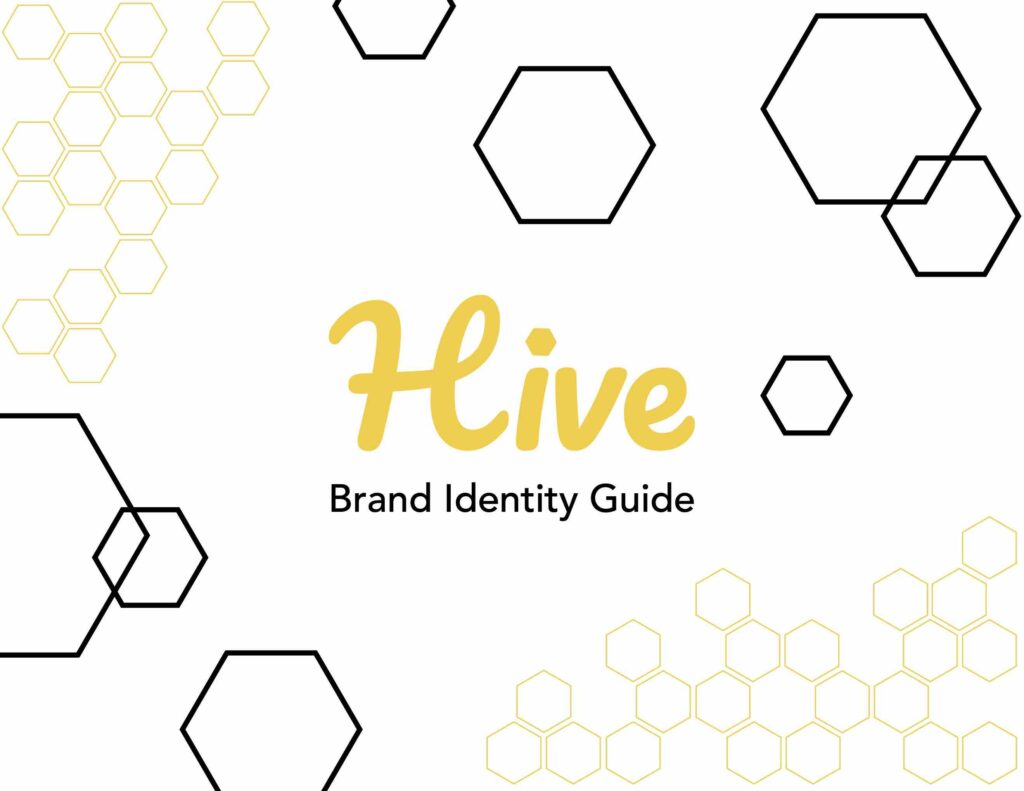
Hive Company Branding
Skills: Branding, Graphic Design
Tools: Adobe Illustrator, Adobe InDesign, Adobe Photoshop, Procreate
Created in 2023
This project focused on developing a complete brand identity system for Hive, a modern workplace productivity app designed to help teams collaborate and stay organized. My goal was to create a visual language that felt clean, efficient, and approachable—reflecting the app’s emphasis on clarity, communication, and forward momentum.
The process began with competitive research into platforms like Asana and Monday.com to understand market trends and identify opportunities for differentiation. I then created a mind map and stylescape to define Hive’s personality and tone, followed by explorations in color, typography, and logo design.
The resulting brand system combines warm, energetic colors with geometric type and minimal iconography, conveying focus and productivity without feeling rigid. The final digital style guide includes logo variations, color and typography specifications, and real-world applications that showcase the flexibility and consistency of the brand.
Final Product
Click the image below to be taken to the interactive PDF.
Logo Iterations
I knew I wanted to incorporate bee imagery but found my early sketches too playful for a tech brand. I moved away from literal representations and began exploring the geometry of the hexagon, which felt more modern and technological.


I experimented with overlapping hexagons outlined in yellow, but the results felt overly delicate (left image). Next, I experimented with yellow, black, and varying opacities to subtly reference the bee, but the results felt too polished or scientific for the brand (middle image). Eventually, I created an abstract bee form by resizing, layering, and filling hexagons to emphasize simplicity and strength (right image).


The final logo uses four shapes—two small yellow and two large black hexagons—arranged to suggest both a bee and a subtle, negative-space “H” for Hive (imagine an “H” rotated 45 degrees counterclockwise). For the logotype, I drew from earlier cursive sketches to retain a sense of warmth and approachability while using a clean sans serif for professionalism. A small hexagon dot above the “i” ties the mark and wordmark together into a cohesive, recognizable system.


