Go the F*** to Sleep Object Posters
Skills: Graphic Design
Tools: Adobe Illustrator, Procreate
Created in 2025
Building on my exploration of Go the F** to Sleep* by Adam Mansbach, this project translates the book’s tone and themes into a bold, minimal poster inspired by early 20th-century Sachplakat design. My goal was to distill the story’s humor and tension—the clash between calm bedtime routines and parental exasperation—into the simplest visual form possible.
I focused on three core ideas: “Bedtime,” “Obstinate,” and “F***.” Together, they capture the book’s playful frustration, its commentary on defiance and exhaustion, and its balance between sweetness and satire. Through pared-down imagery and strong typography, the design conveys the emotional whiplash of parenting with clarity and wit.
Sketches
Iterations
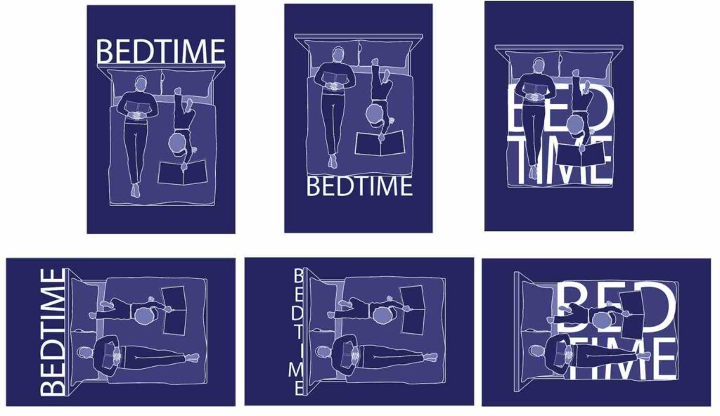
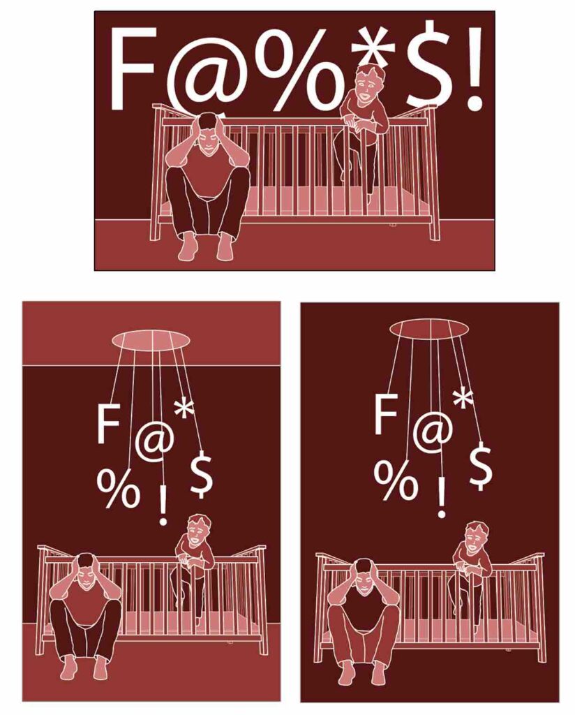
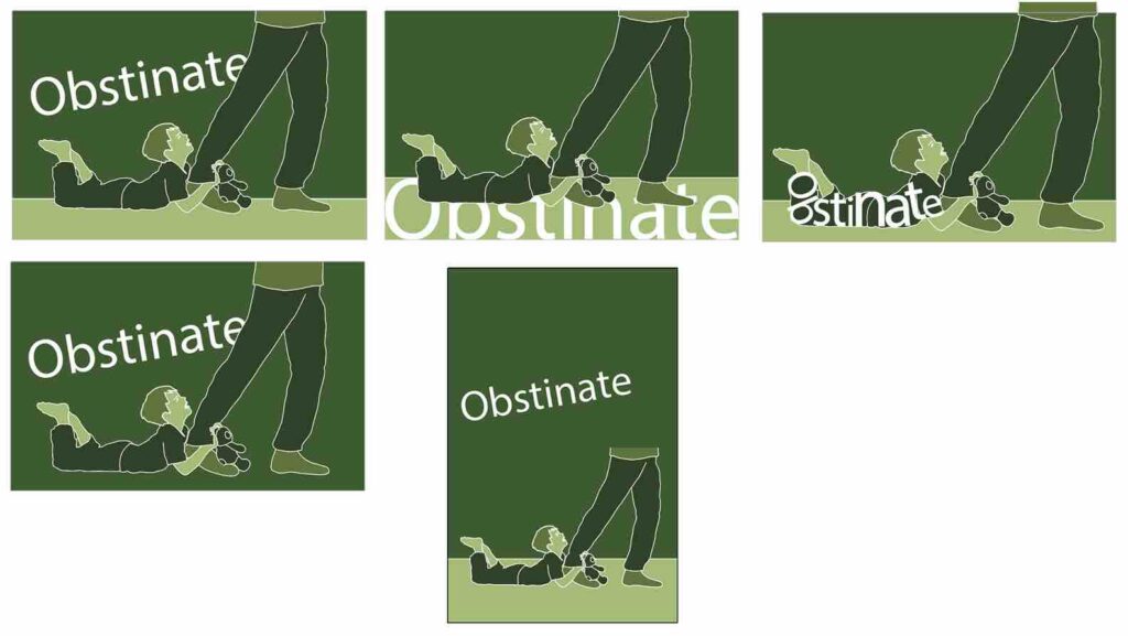
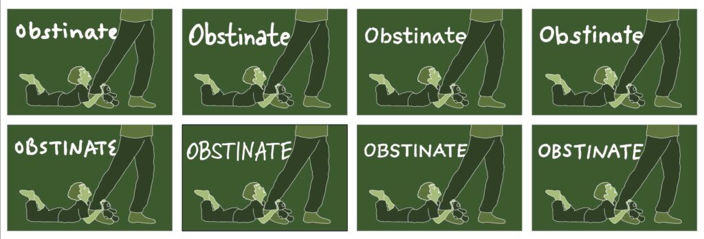
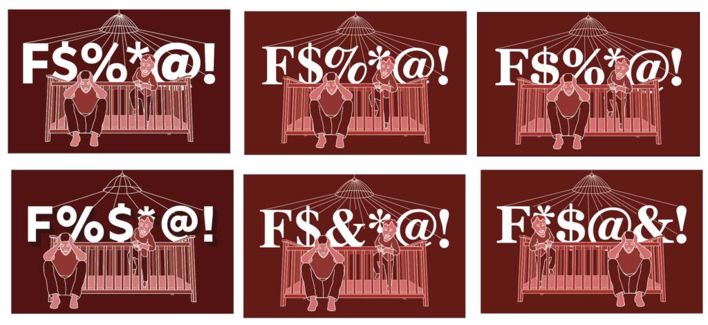
First, I played around with the layout of the words within the context of the poster’s imagery.
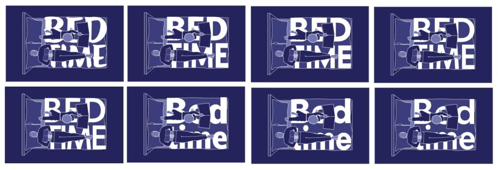
Then, I started testing different fonts in the space, balancing playful with frustrated and intense.
Final Products
My poster series depicts the emotional journey of a parent attempting to put their child to sleep. The first poster, in deep blue, represents initial calm as the parent, hoping to lull their child to sleep, accidentally dozes off while reading—only to wake and find the child still wide awake. Frustration builds in the second poster, shifting to an uneasy green as the restless child clings to the increasingly agitated parent, with the word “obstinate” misspelled in crayon on the wall, hinting at their defiance. The final poster erupts in chaotic red, capturing the parent’s utter exhaustion and exasperation as their child throws a tantrum, pushing them to the brink of a mental breakdown.


