Believer vs. Skeptic
Created in spring 2025 for ADN 502 (Visualizing Narrative)
Prompt: For this assignment, you will choose two excerpts from two written or oral/transcribed narrative that relate to each as a debate, under the theme “Believers and Skeptics.” We will scrutinize how typography, layout and content can interact to create dialogue and discourse. By looking closely at type style, scale, action and interaction, we can create dynamic compositions that help create an interplay of content that is enhanced by the attention to typography. You will create two physical posters, sized 18×24 each that explore physical production through the user of printing, laser cutting, screen printing, stitching, sewing, etc.
My Project: I chose to explore the concept of the male gaze: a masculine, heterosexual perspective that presents and represents women as (sexual) objects for the pleasure of the heterosexual male viewer.
Sketches
During this first part of the project, I emphasized the differences between the male gaze and the female gaze, represented with the following quotes by women that directly addressed each.
Believer (Male Gaze): “Male fantasies, male fantasies, is everything run by male fantasies? Up on a pedestal or down on your knees, it’s all a male fantasy: that you’re strong enough to take what they dish out, or else too weak to do anything about it. Even pretending you aren’t catering to male fantasies is a male fantasy: pretending you’re unseen, pretending you have a life of your own, that you can wash your feet and comb your hair unconscious of the ever-present watcher peering through the keyhole, peering through the keyhole in your own head, if nowhere else. You are a woman with a man inside watching a woman. You are your own voyeur.” — Margaret Atwood, The Robber Bride (1993)
Skeptic (Female Gaze): “The first feminist gesture is to say: ‘OK, they’re looking at me. But I’m looking at them.’ The act of deciding to look, of deciding that the world is not defined by how people see me, but how I see them… The tool of every self-portrait is the mirror. You see yourself in it. Turn it the other way, and you see the world.” —Agnès Varda, Interview (Presumably 2000s – 2010s)
I knew from the getgo that I wanted to use female imagery to highlight the differences between the male and female gaze. The male gaze objectifies and sexualizes women, so the female silhouette for that poster would have especially large and perky breasts and a thin waist with unnaturally curvy hips. She poses in an overtly staged way and looks away from the viewer, representing her passivity. On the other hand, the female gaze’s silhouette has a more realistic body type. She stands with her hips squared, feet planted, and arms braced, looking directly at the viewer, representing her agency, confidence, and power.
For these first rough sketches, I used a placeholder font so I could focus purely on composition. I played around with incorporating the text outside, inside, and overlapping the female figures and how that would affect the quote’s meaning.
Iterations
After getting feedback from my professor, I decided not to differentiate the male gaze from the female gaze, but rather visualize how women are described through the eyes of men—an outlook then adopted by society and ultimately internalized by women themselves. As such, I used the modern Atwood quote as the critic of the male gaze, and chose a much older quote from a man as the supporter of it.
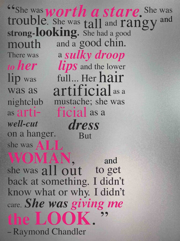
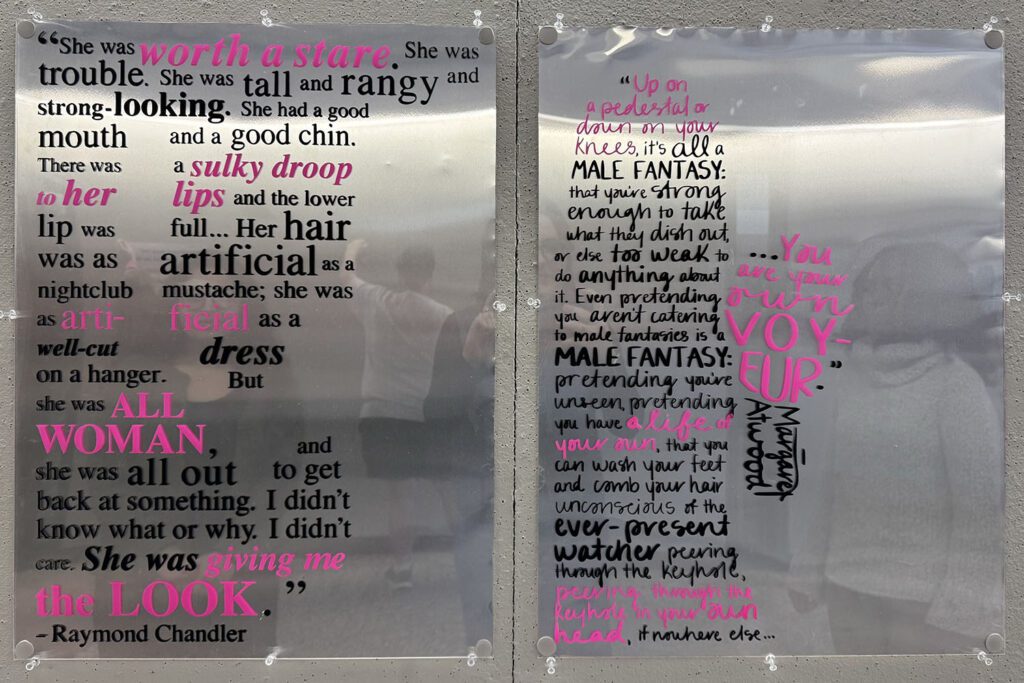
Believer: “I sat down on the edge of a deep soft chair and looked at Mrs. Regan. She was worth a stare. She was trouble. She was tall and rangy and strong-looking. She had a good mouth and a good chin. There was a sulky droop to her lips and the lower lip was full. She had a drink. She took a swallow from it and gave me a cool level stare over the rim of the glass. Her hair was as artificial as a night club mustache; she was as artificial as a well-cut dress on a hanger. But she was all woman, and she was all out to get back at something. I didn’t know what or why. I didn’t care. She was giving me the look.” — Raymond Chandler, The Big Sleep (1939)
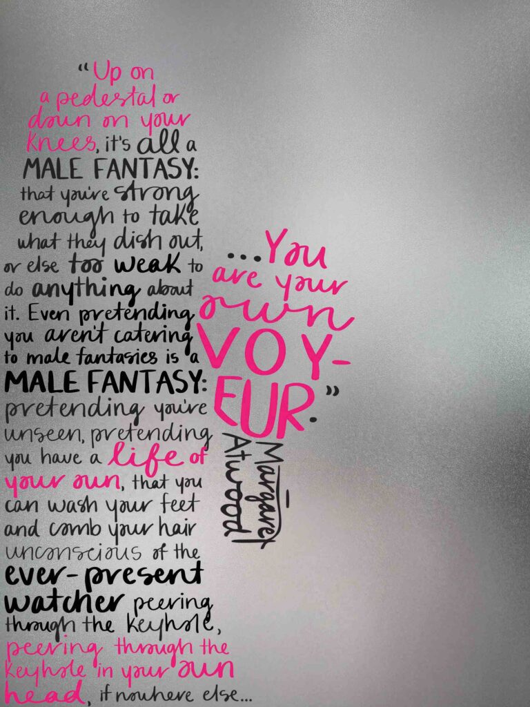
Skeptic: “Male fantasies, male fantasies, is everything run by male fantasies? Up on a pedestal or down on your knees, it’s all a male fantasy: that you’re strong enough to take what they dish out, or else too weak to do anything about it. Even pretending you aren’t catering to male fantasies is a male fantasy: pretending you’re unseen, pretending you have a life of your own, that you can wash your feet and comb your hair unconscious of the ever-present watcher peering through the keyhole, peering through the keyhole in your own head, if nowhere else. You are a woman with a man inside watching a woman. You are your own voyeur.” — Margaret Atwood, The Robber Bride (1993)
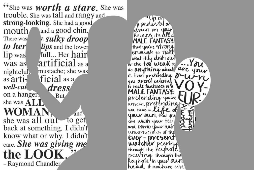
Though I no longer used the Agnès Varda quote, I was inspired by its message and incorporated it into my imagery. The woman in the believer’s poster looks at herself in the mirror, reaffirming that she is something to be looked at and admired—an object, a passive presence. But the woman in the skeptic’s poster turns the mirror outward, rejecting the typical idea of what a mirror is for and, by extension, what it means to be a woman. Instead of reflecting herself, she makes the viewer confront their own image in the act of trying to look at her.
After more feedback, I realized including the entire silhouettes would make it hard to wrap text—whether inside or outside them—and consequently removed the bottom half of the women. Still concerned about how complex the space in each figures’ enclosed arms would be (hand on head in left; hand on hip in right), I simplified the images even further, therefore putting more focus on each woman’s interaction with the mirror—and by extension, her relationship to the viewer.
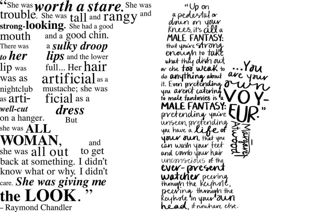
Once I was satisfied with the silhouettes, I could finally focus on the text—first the font, then the layout. The male gaze evokes structure, control, and tradition, so for the poster that upholds it, I knew I wanted a serif or clean sans serif font. I chose Times: a historic typeface that felt fitting for a quote from the 1930s. In contrast, for the poster challenging the male gaze, I wanted something that felt raw and personal—like a woman breaking free from its mold and finding her voice—so I ended up using my own handwriting. I played around with font weight, capitalization, and italicization to highlight key words and phrases in each quote.
Throughout the process, I knew I wanted to incorporate reflective materials to reinforce the symbolism of the mirror in discussions of the male versus female gaze. To create visual contrast between the two posters, I decided that one would have its text contained entirely within the positive space of the female figure, while the other would wrap around her negative space. Since the male gaze projects meaning onto women and imposes expectations, the text of the believer’s poster is in the negative space. The words surround her, shape her, and confine her—she becomes defined not by her own voice, but by what is said about her. The use of reflective material means the viewer’s own face fills the space inside her, literally imposing their identity onto hers. In contrast, the skeptic’s poster places the text within the figure’s positive space, symbolizing a woman who defines herself and actively shapes how she is seen. Here, the viewer’s reflection appears only in the background, never overtaking her form.
Final
To further highlight important phrases from the rest of the black text, I used pink ink. Pink is stereotypically a “female” color, so its use in the believer’s poster upholds stereotypes, while it’s meant to subvert and reject them in the skeptic’s poster. The following images are the final digital posters.
After I had finalized the digital composition, I had to brainstorm how to physically create the posters. Having lots of experience with screen printing, I gravitated to that medium, but wasn’t sure how to incorporate the reflectivity. Tinfoil would be cheap but more shiny than reflective, not to mention easily crinkled. Mirrors were expensive, incredibly heavy, and so reflective that the viewers’ image would overpower the design itself. I debated using glass, which would be transparent rather than reflective, altering the meaning of the viewers’ interaction with the work. I ultimately experimented with screen printing on both sturdy metal sheets and pieces of acrylic. The final images layered screen-printed acrylic pieces over the metal sheets to create an image that allowed you to see your reflection, but not so clearly that it overwhelmed the image itself.


